The Backstory to “Swaying the Public”: A Design Chronicle of Election Forecast Visualizations
Fumeng Yang - Northwestern University, Evanston, United States
Mandi Cai - Northwestern University, Evanston, United States. Northwestern University, Evanston, United States
Chloe Rose Mortenson - Northwestern University, Evanston, United States
Hoda Fakhari - Northwestern University, Evanston, United States
Ayse Deniz Lokmanoglu - Northwestern University, Evanston, United States
Nicholas Diakopoulos - Northwestern University, Evanston, United States
Erik Nisbet - Northwestern University, Evanston, United States
Matthew Kay - Northwestern University, Chicago, United States
Screen-reader Accessible PDF
Download preprint PDF
Download Supplemental Material
Room: Bayshore II
2024-10-17T18:21:00ZGMT-0600Change your timezone on the schedule page
2024-10-17T18:21:00Z

Fast forward
Full Video
Keywords
Uncertainty visualization, probabilistic forecasts, design space, animation
Abstract
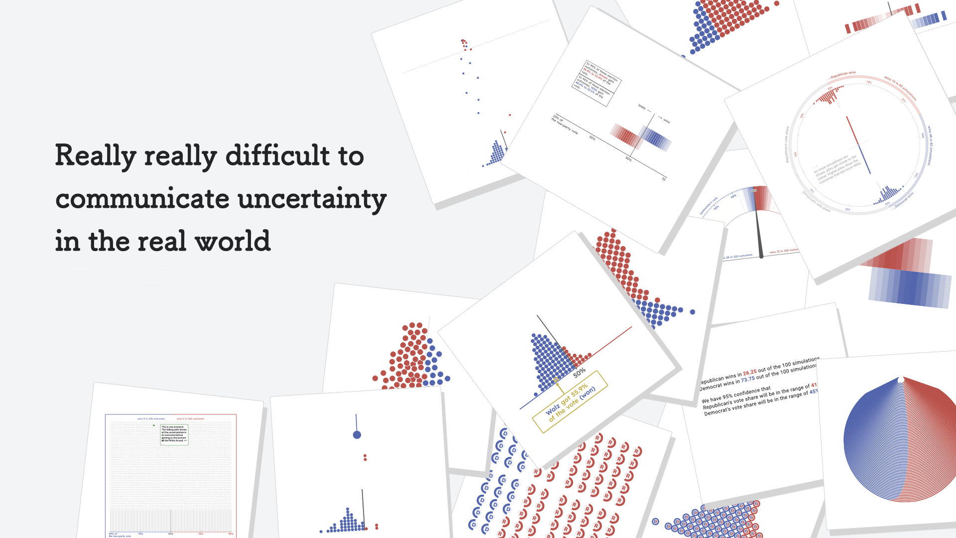
A year ago, we submitted an IEEE VIS paper entitled “Swaying the Public? Impacts of Election Forecast Visualizations on Emotion, Trust, and Intention in the 2022 U.S. Midterms” [50], which was later bestowed with the honor of a best paper award. Yet, studying such a complex phenomenon required us to explore many more design paths than we could count, and certainly more than we could document in a single paper. This paper, then, is the unwritten prequel—the backstory. It chronicles our journey from a simple idea—to study visualizations for election forecasts—through obstacles such as developing meaningfully different, easy-to-understand forecast visualizations, crafting professional-looking forecasts, and grappling with how to study perceptions of the forecasts before, during, and after the 2022 U.S. midterm elections. This journey yielded a rich set of original knowledge. We formalized a design space for two-party election forecasts, navigating through dimensions like data transformations, visual channels, and types of animated narratives. Through qualitative evaluation of ten representative prototypes with 13 participants, we then identified six core insights into the interpretation of uncertainty visualizations in a U.S. election context. These insights informed our revisions to remove ambiguity in our visual encodings and to prepare a professional-looking forecasting website. As part of this story, we also distilled challenges faced and design lessons learned to inform both designers and practitioners. Ultimately, we hope our methodical approach could inspire others in the community to tackle the hard problems inherent to designing and evaluating visualizations for the general public.